Let’s build experiences that work for real people.
Designing a modern website is about more than just sleek visuals or trendy effects. It’s about understanding people. How they think. What they need. What makes them stay. At Bloom, we believe great UX/UI Design begins with empathy and grows through collaboration.
Whether you’re launching something new or refining what already exists, these principles are more than trends. They’re how we build meaningful experiences together.
Before we dive into visuals or layouts, we begin by understanding who we’re designing for. It’s not just about ticking a research box. It’s about listening first, so the design serves real needs, not assumptions.
“Design is not just what it looks like and feels like. Design is how it works.” – Steve Jobs
At Bloom, we use a range of user research methods to guide our decisions. Whether it’s interviews, surveys, or usability tests, these tools help shape experiences that feel intuitive and human. If you’re exploring research methods yourself, Nielsen Norman Group’s guide offers a helpful breakdown based on your goals and timeline.
Overly clever design can be confusing. If users need to guess what something does, they probably won’t stick around. Clear navigation, straightforward language, and clean structure help users feel confident and in control.
“Usability is about people and how they understand and use things, not about technology.” – Steve Krug
When a design needs a lot of explanation, it’s usually a sign to simplify.
Every page should guide people naturally from one section to another. We focus on visual hierarchy through thoughtful use of spacing, contrast, size, and alignment so users move through content with confidence.
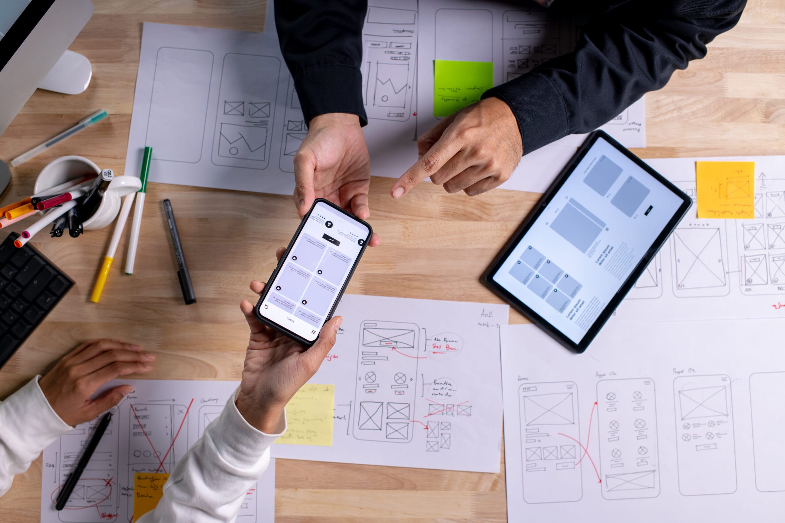
We begin with structure first. Wireframes help reveal what’s essential and how interactions should flow before style gets added.
If you’re building or refining a design system, I recommend using the Design System Checklist for Figma by Headway. It covers foundational styles, reusable components, accessibility considerations, and guidance on documentation and governance.
A clear visual hierarchy is not only about aesthetics—it’s about making interaction feel calm and easier to follow.
Consistency in design creates familiarity. When colors, buttons, and tone of voice feel aligned, users feel at ease and know what to expect. That feeling of reliability builds trust.
We use flexible design systems to maintain consistency without stifling creativity. Material Design from Google is a great example of this balance.
Thoughtful repetition across your site helps users navigate more easily and feel more connected to your brand.
Most users are interacting with websites on mobile devices. Starting with a mobile-first approach helps prioritize what truly matters and prevents clutter. A streamlined mobile layout often leads to a more effective desktop experience too.
“Design for the smallest screen first, then add features as you go.” – Luke Wroblewski
If a site feels good on a small screen, it will feel great everywhere else too.
Accessibility is not a bonus feature. It’s a core part of good UX/UI Design. Inclusive design means more people can engage with your product, and often leads to cleaner, more thoughtful experiences for everyone.
We use tools like WebAIM’s contrast checker and reference W3C’s guidelines to ensure that our work is usable by a wider audience.
We’re always learning and improving. Designing for everyone is a commitment we take seriously.
Design isn’t something you finish and walk away from. It evolves through feedback. Testing ideas, listening to real users, and making improvements all lead to stronger results.
Usability.gov shares great tools and methods for usability testing that can be used throughout the design process.
We value reflection just as much as execution. That’s why we build feedback into every phase of the work.
UX/UI Design is more than a finished product. It’s an ongoing conversation between you and your users. Every scroll, click, and interaction tells part of that story.
At Bloom, we approach this work as collaborators. We listen first. We ask thoughtful questions. We stay curious and flexible throughout the process. You don’t have to figure it all out alone. We’re here to help shape something meaningful, together.
“We work with you, not just for you.”
If you’re ready to create a website or product that truly connects with people, let’s talk. We’d love to hear your ideas and start building something that feels real.
Bloom offers an extensive array of development, support, and maintenance solutions as well as data-based creative services to simplify and streamline digital marketing for small businesses and startups through strategies that fit any budget and timeline.
Copyright © 2025 Bloom Designers