Why building websites that adapt is more essential than ever—and how we do it together.
In 2025, the digital world moves fast. Screens are changing shape, platforms are multiplying, and users expect seamless experiences everywhere. That’s why Responsive Web Design isn’t a trend—it’s a standard.
Let’s explore why responsive design matters more than ever and how we work alongside you to build websites that don’t just look good – but feel right on every screen.
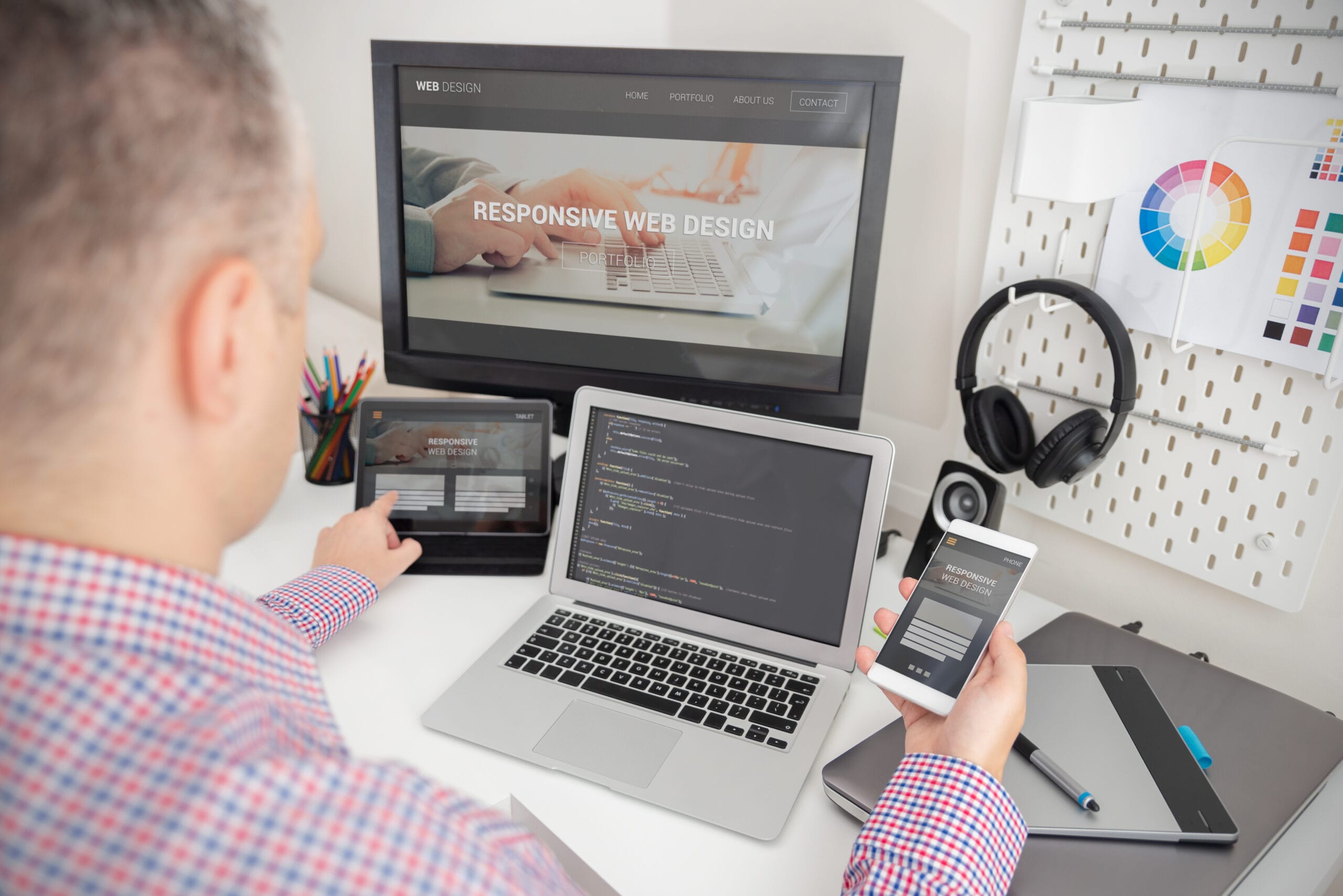
Responsive Web Design is a design strategy that ensures your website automatically adapts its layout and content to fit different screen sizes and devices – desktops, tablets, phones, smart TVs, and even wearables.
As Ethan Marcotte, who first introduced the concept in 2010, explains:
“Rather than tailoring disconnected designs to each of an ever-increasing number of web devices, we can treat them as facets of the same experience.”
That experience – fluid, accessible, and unified – is what today’s users expect.
From mobile-first to multi-device-first, people aren’t just browsing on phones. They’re switching between screens constantly. According to Statista, mobile accounts for over 58% of global web traffic – and that number is still growing.
Google prioritizes mobile-friendly websites through its mobile-first indexing. If your site isn’t responsive, it may not show up in search results…plain and simple.
People bounce quickly from websites that feel clunky or slow. According to Google research, 53% of users leave a mobile site if it takes longer than three seconds to load.
Responsive design ensures your site loads fast, feels intuitive, and keeps visitors engaged, regardless of how they get there.
We’ve talked to countless business owners who feel overwhelmed by web design decisions. Here’s what responsive design actually helps with:
“We obsess over the details so you don’t have to.”
That means font sizing, image scaling, content flow – all thoughtfully crafted to work across devices.
At Bloom, we don’t dive straight into pixels and code. We begin with your goals, your users, and your unique story.
Here’s how we bring responsive design to life with you:
We involve you in every stage—from strategy and wireframes to final launch.
“Your insight is as valuable as our design.”
We test across actual phones, tablets, and monitors, because simulations don’t tell the whole story.
If something won’t work, we’ll tell you why and what we recommend instead.
“Here’s how we got to this decision.”
Still relying on an outdated, static website? You’re not alone and it’s not your fault. Many businesses wait to refresh their site because it feels too complex or expensive.
We’re here to change that narrative with collaboration, empathy, and clear process.
“We won’t pretend to know it all. But we will ask the right questions.”
Whether you’re refreshing your brand or launching from scratch, Responsive Web Design is the foundation for showing up right in 2025. And we’re here to build it with you.
Let’s make something responsive – and remarkable – together.
Bloom offers an extensive array of development, support, and maintenance solutions as well as data-based creative services to simplify and streamline digital marketing for small businesses and startups through strategies that fit any budget and timeline.
Copyright © 2025 Bloom Designers